 新起点博客
新起点博客下拉菜单项的默认的状态(不用设置)有悬浮状态(:hover)和焦点状态(:focus):
/*查看bootstrap.css文件第3049行~第3054行*/
.dropdown-menu > li > a:hover,
.dropdown-menu > li > a:focus {
  color: #262626;
  text-decoration: none;
  background-color: #f5f5f5;
}
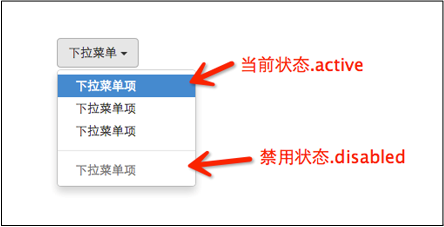
下拉菜单项除了上面两种状态,还有当前状态(.active)和禁用状态(.disabled)。这两种状态使用方法只需要在对应的菜单项上添加对应的类名:
<div class="dropdown">
  <button class="btn btn-default dropdown-toggle" type="button" id="dropdownMenu1" data-toggle="dropdown">
  下拉菜单
  <span class="caret"></span>
  </button>
  <ul class="dropdown-menu" role="menu" aria-labelledby="dropdownMenu1">
    <li role="presentation" class="active"><a role="menuitem" tabindex="-1" href="#">下拉菜单项</a></li>
    ….
    <li role="presentation" class="disabled"><a role="menuitem" tabindex="-1" href="#">下拉菜单项</a></li>
  </ul>
</div>
运行效果如下:
对应的样式代码也非常简单:
/*请查看bootstrap.css文件第3055行~第3075行*/
.dropdown-menu > .active > a,
.dropdown-menu > .active > a:hover,
.dropdown-menu > .active > a:focus {
  color: #fff;
  text-decoration: none;
  background-color: #428bca;
  outline: 0;
}
.dropdown-menu > .disabled > a,
.dropdown-menu > .disabled > a:hover,
.dropdown-menu > .disabled > a:focus {
  color: #999;
}
.dropdown-menu > .disabled > a:hover,
.dropdown-menu > .disabled > a:focus {
  text-decoration: none;
  cursor: not-allowed;
  background-color: transparent;
  background-image: none;
  filter: progid:DXImageTransform.Microsoft.gradient(enabled = false);
}


评论前必须登录!
注册